An Introduction to Plotting in Python
After having some Applied Math friends rant to me at how awful plotting was in Python I decided to write up a quick guide to hopefully change their minds.
Numpy
This assumes a basic familiarity with numpy, although I’ll go over the basics really quickly just in case. The syntax/API is very similar to MATLAB, so any familiarity with MATLAB will help.
import numpy as np
We can initialize an array from a normal list using array(), create ranges using arange(), or create evenly distributed numbers using linspace().
np.array(range(3))  #=> array([0, 1, 2])
np.arange(3)  #=> array([0, 1, 2])
np.linspace(0, 1, 3)  #=> array([0, 0.5, 1])
Operations can be applied to these arrays on an element-wise basis.
Indexing can be done on any axis (up to the max number of axes the array has). Given some n-dimensional array, the first index corresponds to the first row, the second index corresponds to the first column, etc.
>>> a = np.zeros((5, 2))
>>> a
array([[ 0.,  0.],
       [ 0.,  0.],
       [ 0.,  0.],
       [ 0.,  0.],
       [ 0.,  0.]])
>>> a[0]
array([ 0.,  0.])
>>> a[:, 0]
array([ 0.,  0.,  0.,  0.,  0.])
Let’s talk about matplotlib
By default, matplotlib provides two different interfaces to control plotting.
- A State-Machine Interface (very similar to MATLAB)
- An Object-Oriented Interface (more pythonic)
We’ll go over both, especially since they can be used in tandem and both provide easy ways to approach problems.
For the official documentation click here.
Let’s talk pyplot
The pyplot module provides this state-machine interface, where the global state of all figures is maintained without the user directly specifying which figure they’re editing.
import matplotlib.pyplot as plt
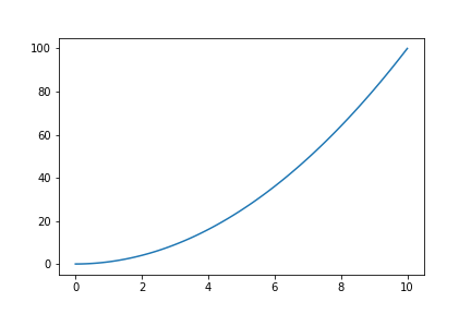
Let’s assume we have some generic dataset. I’ll create a random one just for an example that uses [latex]f(x) = x^2[/latex].
x = np.linspace(0, 10, 100)
y = x**2
So let’s plot it.
plt.figure()  # Creates a new figure
plt.plot(x, y)  # Plots a line with our data
plt.savefig('out.png')  # saves it to a file (in current directory)
# Can also use plt.show() to display using your front-end
Object Oriented Approach
We can use pyplot for the initial figure creation, or we can be more verbose and use the object oriented approach (which is very similar).
fig = plt.figure()  # Creates a new figure (same syntax as above)
ax = fig.add_axes([0.1, 0.1, 0.8, 0.8])  # Adds axes to the (initially blank) figure
ax.plot(x, y)  # Plots the line on our axes
plt.savefig(out)  # Saves the figure (same as above)
This creates the same plot as above.
Configuration
Given the basic structure above, we can tweak settings and change things around. Let’s go over common configurations (code provided for both approaches)
-
Figure-size - Add arguments to the figure creation
plt.figure(figsize=(width, height))(same for both)
-
Labels - Use
xlabelandylabelplt.xlabel('Some X Axis Label')(state machine)ax.set_xlabel('Some X Axis Label')(object oriented)
-
Title - Use
titleplt.title('Some Amazing Plot Title')(state machine)ax.set_title('Some Amazing Plot Title')(object oriented)
Pandas
We can also use pandas, which is built on matplotlib for its plotting. pandas is very powerful and can create amazing plots in very few lines of code.
import pandas as pd
data = pd.DataFrame({'x': x, 'y': y})  # create a new DataFrame from our dataset
data.plot(
    x='x',
    y='y'
)  # Plot the data setting the X and Y axis datapoints.
plt.show()  # show

For more examples see the official visualization docs here.
Final Thoughts
This isn’t mean to be a comprehensive guide on plotting in Python, but rather an argument that plotting isn’t some giant nightmare like my mathematician friends are convinced it is. If you have questions or want a follow up article on something specific, let me know in the comments down below.